Saar-Mosel Werke: A fresh brand, familiar values
Cooking, showering, drinking, or swimming – the services provided by the Konz municipal utilities (Verbandsgemeindewerke Konz AöR) accompany the citizens of Konz throughout the day. Their traditional portfolio includes water supply, wastewater disposal, and the operation of the indoor swimming pool in Konz. However, many services have been added in recent years, particularly in the energy sector. Therefore, it's time to acknowledge this diversity with a new corporate identity.
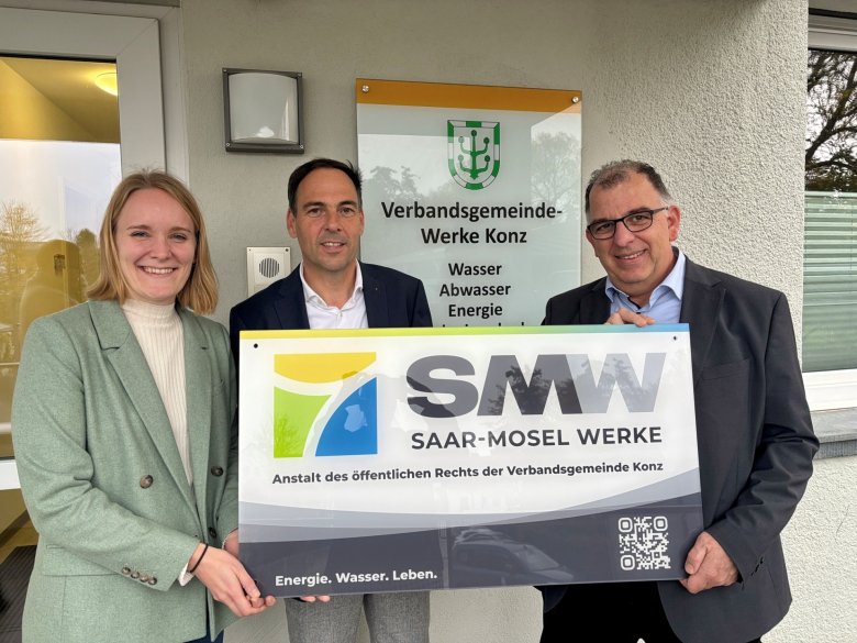
This includes, among other things, a new name. The established "Verbandsgemeindewerke Konz AöR" will be called "Saar-Mosel-Werke Konz," or SMW for short, from November 1, 2025. In addition to a new, clear, and customer-oriented website, which will be accessible at www.smw-konz.de In addition to the new logo, there is also a new logo - as colorful as the company's services.

“Our old logo has faithfully served us for many years,” explains board member Ralf Zorn. “But time marches on: With the establishment of a public-law institution (AöR) in 2024, we became legally independent. We have evolved into a modern service provider that, for example, actively shapes the energy transition in all areas. We develop sites for photovoltaic systems, operate wind turbines, and expand the infrastructure for e-mobility. The logical consequence is to reflect all of this in our public image. At the same time, we remain true to our values: We continue to be a reliable, competent, municipal utility provider for our customers and sustainably improve the quality of life in the Konz municipality with modern infrastructure.”
The new logo was developed to reflect the region's distinctive character. At its center is the confluence of the Saar and Moselle rivers. This symbolizes the Saar-Mosel Works' regional roots and its connection to the owner of the public-law institution, the Konz municipality. At the same time, the new logo clearly distinguishes itself from the old one, emphasizing the legal independence of Saar-Mosel Works. For customers, it is now unambiguously clear: my contact for all questions regarding water, wastewater, swimming pools, or specific energy projects is SMW. Confusion is now less likely.
The three colors of the logo symbolize the company's different areas of operation: Blue represents water and wastewater – services that have been part of the company's portfolio for decades. Green stands for "life" and the role that SMW plays in the everyday lives of its customers, for example, through the operation of the Saar-Mosel-Bad swimming pool. Yellow symbolically represents energy and the many forward-looking projects for the energy transition.
“The new Saar-Mosel Werke’s appearance combines modernity and dynamism with tradition,” said Guido Wacht, Chairman of the SMW Supervisory Board. “With this redesign, Saar-Mosel Werke underscores the necessary evolution from a technical service provider for basic services to a public-law municipal enterprise with additional responsibilities for a sustainable, innovative future.”

